
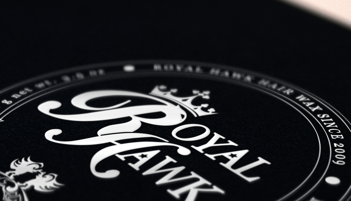
Royal Hawk Wax Logotype
Art Direction // Visual design // 07/2012 Royal Hawk is a brand in the U.S. dedicated to male hair styling products.
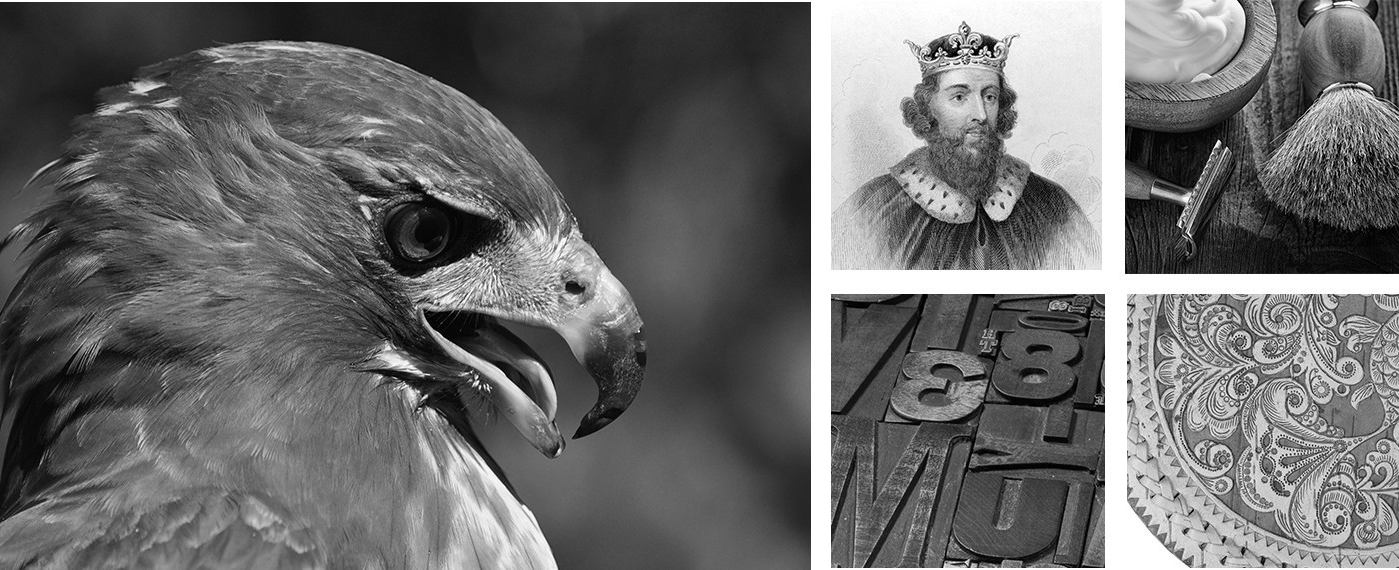
INSPIRATION
The primary sources of inspiration float around royalty and hawks, while the secondary and less dominant are the vintage intention combined with a classic feel on type and composition.
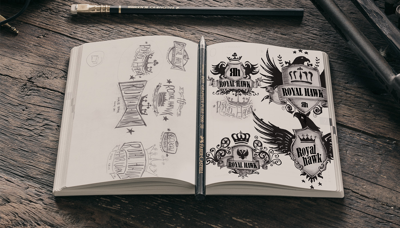
IDEATION
The goal was to develop a unique seal style logotype, which would indicate the products function along with an specific personality. The dominance focuses on the name of the brand using and the hawk and royalty influence on visual components to enforce messaging.
Execution Portfolio
The main goal was to execute an accurate visual description of the brands name and personality by applying a conservative lettering composition in a seal setup. This allowed us to explore utilizing the RH portion as the main focus brand communicator. After a number of variations, the hawk styled R provided the dominance required to the brand personality visual queues to allow brand memory.
